Brand Resources
Brand Guidelines
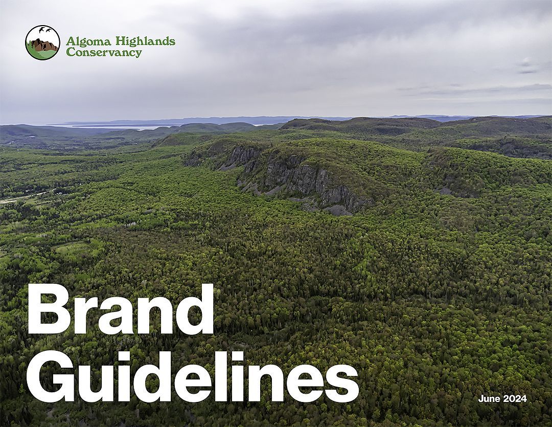
In these guidelines, you’ll find everything you need to represent Algoma Highlands Conservancy (AHC) visually and verbally. Each unique element works together to bring our story to life.
We want to make sure our brand is consistent and recognizable when you share it with the world.
Download the full brand guidelines to learn more.
Logo
Our logo is the cornerstone of our visual identity.
It should always be given a place of importance, away from other visual elements, including text. It should never appear small, crowded or boxed in.
Use the primary logo against a white background whenever possible. This will ensure there is sufficient contrast for the logo to stand out. A very light colour or low contrast photo can also work.
Logo Downloads

Typography
Neue Haas Grotesk Display Pro is our primary typeface. It has a clean, contemporary style that is easy to read at various sizes. It’s an important element of our visual identity and must be used on all of our marketing and communications.
Headlines
Use the “75 Bold” weight for headlines.
Body copy
Use “55 Roman” weight for body copy.
Downloads
You can download a TrueType version of the Neue Haas Grotesk font family from CDNFonts.com at no charge.
A better version of the font is available in OpenType format from
Adobe Fonts but requires a paid subscription.


